Getting to the heart of the brief
The ambition was to help more people picture themselves in policing. Working with the wider team, I explored what might encourage someone to join, what could hold them back and how the campaign could connect with people who might never have considered the role. The idea also needed to sit alongside a short promotional film and be flexible enough for other forces to use.
Listening before designing
Our early assumption was that the excitement of the job would be the strongest draw: the action, investigations and experiences people associate with policing on television. Focus groups with serving officers told a different story. The motivation that kept coming through was the chance to make a difference to their community. Research also highlighted cultural and historical barriers shaping perceptions of policing. Those conversations gave the creative work a clearer purpose: to put people, belonging and community at the centre of the message.
Breaking away from the familiar
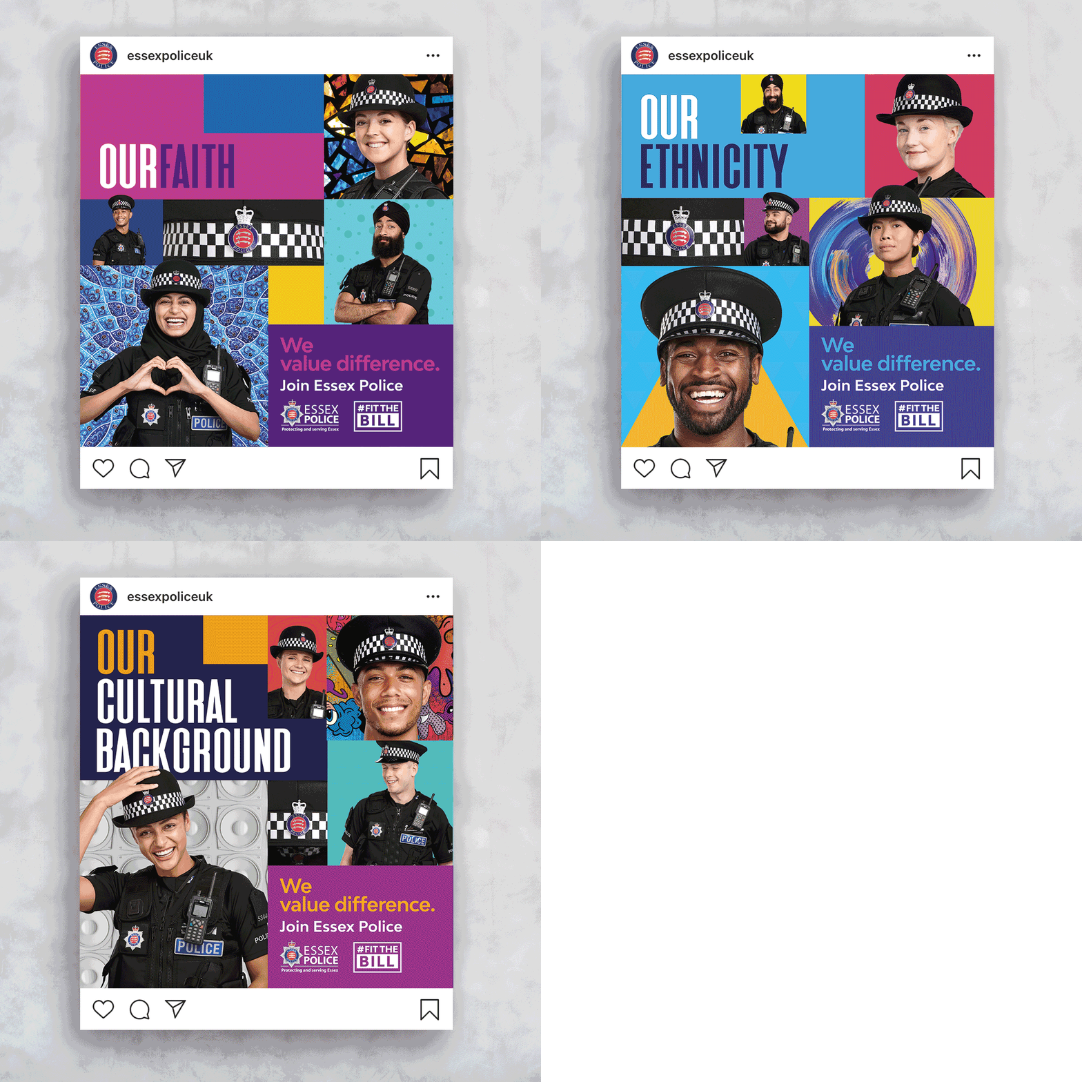
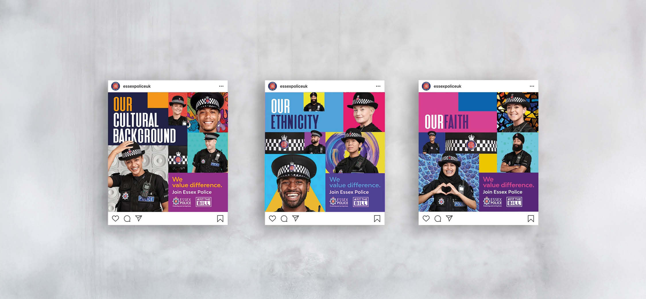
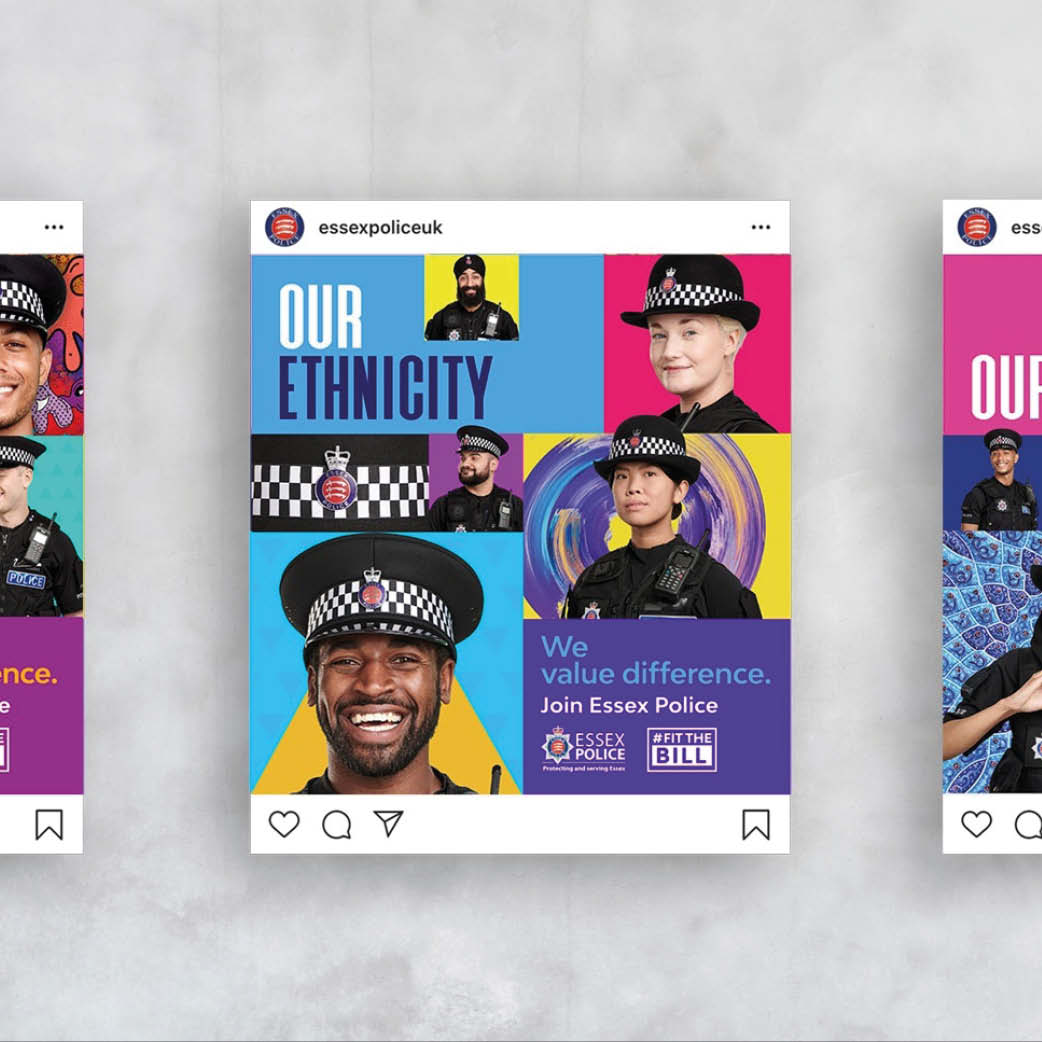
I looked at other police recruitment campaigns and found a lot of similar visual approaches. There was an opportunity to create something brighter, more expressive and more welcoming. With social media a major part of the rollout, the identity needed to catch attention quickly and give people a reason to pause. I developed a confident visual direction using vibrant colour, bold graphic layouts and portraits that put individuality at the forefront.
Giving difference a visual language
The campaign brought together people from a range of backgrounds, with individual graphic backdrops expressing aspects of personality, experience and identity. Paint splashes suggested creativity, while other patterns drew on cultural and faith references. Each treatment had its own character, with a consistent approach to colour and composition holding the campaign together. The aim was to celebrate the qualities people could bring to the force and help a wider audience feel that they had a place in it.
Taking the campaign into the county
I carried the identity across social media assets, bus advertising, large roller banners, event flags and hoarding around a police station undergoing work. Each format needed a different balance of imagery, message and scale, while still feeling part of the same campaign. From a small post on a phone to a large outdoor display, the design gave Essex Police a distinctive and recognisable presence.
Building on the response
The campaign attracted interest from other police forces, leading to a second phase involving additional forces. I produced the artwork adaptations, giving each force its own material while making use of the existing creative approach to help keep costs down. The team also shared the research and results through online seminars, responding to interest from other communications teams in how the campaign had been developed.